Seasonal Color Analysis: How To Find Your Season!
Color season analysis is a method used to determine the colors that best complement an individual’s natural complexion, eye color, and hair color.
Based on the harmonies and contrasts found in the different seasons of the year, this approach categorizes personal coloration into four main seasons: spring, summer, autumn, and winter.
This methodology provided a framework for people to identify which ‘season’ they fall into, based on the colors that best complement their natural features.
By identifying which season a person falls under, they can select clothing, makeup, and accessories in shades that enhance their natural beauty.
Each color season is associated with a set of characteristics.
For example, spring is often linked with warm hues and bright colors reminiscent of blooming flowers and clear skies while summer is associated with cooler, muted tones reflecting the softness of the season’s landscape.
Autumn brings to mind the rich, earthy colors of falling leaves, and winter corresponds with bold, clear, and icy hues.
Understanding color season analysis can be empowering.
It enables individuals to make informed choices when developing their personal style and wardrobe.
This process of following the seasonal color palette may increase confidence and ensure that one’s appearance is as vibrant and harmonious as the seasons themselves.
Color Season Analysis has evolved over time but originally gained popularity in the 1980s, particularly with Carole Jackson’s book “Color Me Beautiful”.
Understanding Color Season Analysis
Color Season Analysis combines the principles of color theory and personal fashion to guide individuals in choosing clothing and makeup that complements their natural coloration.
The process is grounded in the categorization of people’s coloring into different ‘seasons’ akin to the tones present in nature throughout the year.
Fundamentals of Color Theory
Color theory is essential in understanding how colors interact with each other and how they can be perceived when used in combination.
The color wheel is a visual representation of colors arranged according to their chromatic relationship.
Primary colors are red, yellow, and blue, and they combine to form secondary and tertiary colors.
In color season analysis, the wheel helps determine which colors harmonize with a person’s skin tone, hair color, and eye color, enhancing their natural palette.
Identifying Different Color Seasons
To identify a person’s color season, one assesses their skin color and undertones, contrast levels, and overall coloring.
Here’s how the seasons break down:
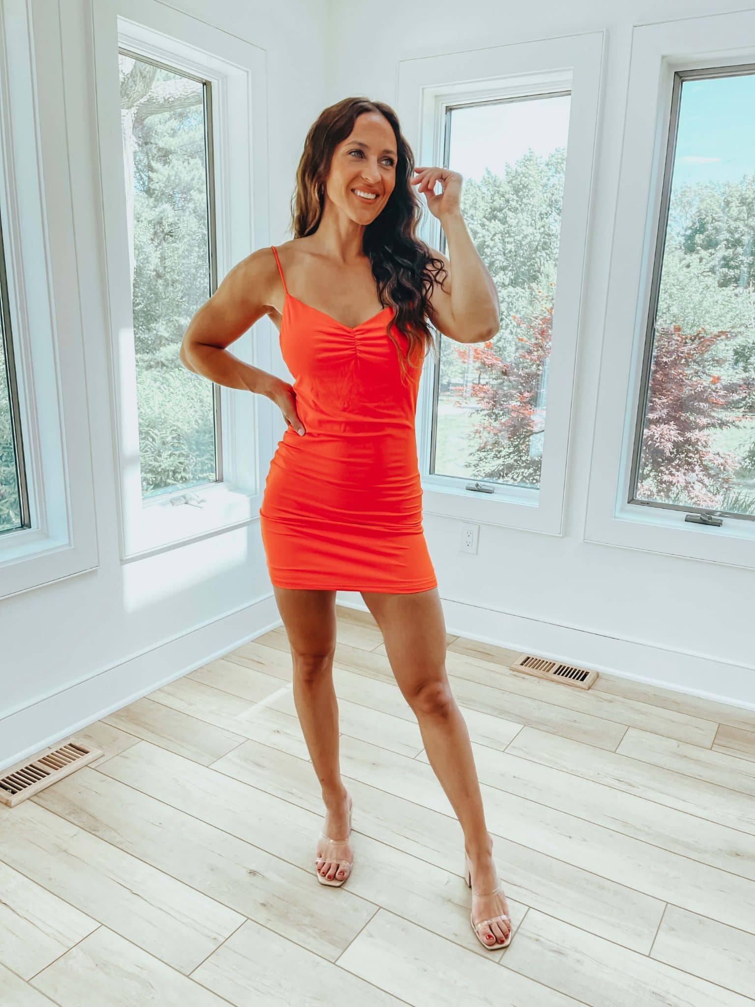
Spring: Typically, individuals with medium or light hair, clear warm eyes, and a warm skin tone.
Their best colors are warm, and bright, and often resemble spring’s sense of renewal and brightness.
Summer: Often has soft, ashy hair, cool eyes, and cool undertones.
Summer colors are muted, often with cool and pastel tones resembling gentle summer sunsets and dappled light.
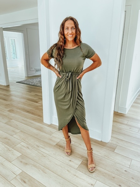
Autumn: Characteristics include rich, warm hair colors, earthy eye colors, and golden undertones in the skin.
Autumn’s palette is filled with earth tones, reflecting the rich and warm colors of falling leaves.
Winter: Those in this category have high contrast in their features with dark hair color, vivid eyes, and cool undertones.
Winter colors are bold and clear, mirroring the sharpness and clarity of frosty winter days.
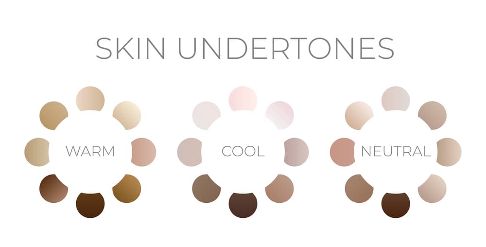
The Role of Skin Undertone
Skin undertone is fundamental in determining one’s color season.
Individuals with cool undertones typically have blue or pink hues to their skin and may have fair to dark skin.
In contrast, those with warm undertones often exhibit peach, golden, or yellow hues.
A simple way to identify skin undertone is the vein test: if veins appear blue, one likely has cool undertones, while bright green veins suggest warm undertones.
Influence of Eye and Hair Color
Eye and hair color are also critical in personal color analysis.
For instance, someone with blue or hazel eyes and blonde hair might belong to the Spring or Summer color seasons, implying they suit soft and warm colors well.
Conversely, individuals with dark eyes and dark brown hair or black hair may find colors from the Winter palette more flattering, emphasizing their rich natural tones.
| Hair Color | Eye Color | Likely Color Season |
|---|---|---|
| Light Brown or Blonde | Blue | Spring or Summer |
| Light Brown | Hazel | Spring or Summer |
| Dark Brown | Dark Eyes | Autumn or Winter |
| Black | Brown Eyes | Winter |
Determining Your Color Season
To determine your color season, one should assess their skin undertone, eye color, and natural hair color in natural lighting.
A professional color consultation might involve comparing different color fabrics against the skin to see which hues make the skin appear vibrant and healthy.
For those who don’t think they can figure this out on their own, a meeting with a professional color analyst is a great idea.
However, if you decide to try navigating the process of selection on your own the white paper test is the best way to go.
To do this simply hold a piece of white paper next to the face to check if the skin appears more golden or more blue, indicating warm or cool undertones, respectively.
When trying personal color analysis for the first time, starting with neutral colors that match the warmth or coolness of your undertones is advisable.
Experimentation with color palettes such as pastels for light skin and jewel tones for dark skin can be enjoyable and fun.
You may even find that a color you never thought would look good on you works beautifully for your skin/hair.
Here’s a pro tip: Bring a color fan when shopping! If you’re unsure about the color of an item you are considering purchasing, you can always use the fan to confirm the color works well for you!
This is especially useful at stores like Old Navy, Express, etc. as they tend to carry a wide range of colors.
One should note that the ultimate goal is to find colors that complement their unique features, enhancing their natural beauty and building confidence in color choices.
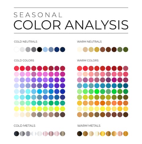
Remember that in the seasonal palette, Summer and Winter are cool seasons, while Spring and Autumn are warm, helping individuals make guided choices in their wardrobe selections.
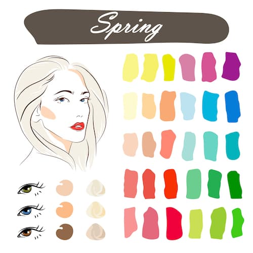
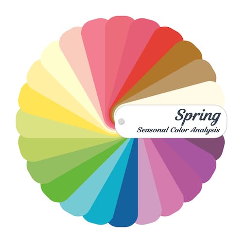
Spring Palette Explained
The Spring palette features warm, light, and clear colors, reflecting the freshness of the season.
Individuals who suit the Spring palette, often broken down even further into Light Spring, Warm Spring, Clear Spring, and Bright Spring, typically have a clear, warm, and bright appearance.
The colors in this palette include soft peach, light moss greens, and delicate yellows, with an overall emphasis on pastel hues and bright, warm shades.
- Light Spring: Think of creamy whites and soft blues.
- Warm Spring: Golden yellows and warm greens are characteristic.
- Clear Spring: Vibrant turquoise and coral exemplify this subgroup.
- Bright Spring: Lemon yellow and bright coral are standout shades.
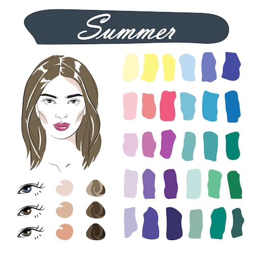
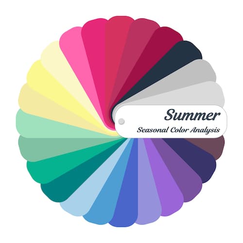
Summer Palette Variations
The Summer palette is characterized by cool, soft, and muted tones, symbolizing the subdued warmth of the season.
The Cool Summer, Light Summer, Soft Summer, and True Summer categories each contain colors that are understated yet elegant.
They range from cool pastels to neutral greys, including lavender, soft blues, and gentle rose.
- Cool Summer: Soft raspberry and grey-blues are favorites.
- Light Summer: Powder pink and pale lavender fit perfectly.
- Soft Summer: Dusty rose and muted blues distinguish this group.
- True Summer: Includes pale blues and soft plums.
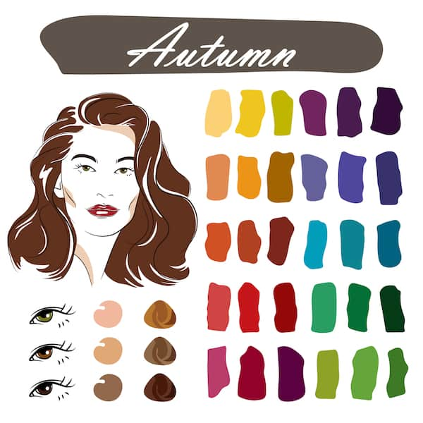
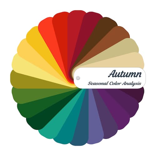
Autumn Palette Shades
The Autumn palette resonates with the rich, earthy tones of the season.
Encompassing the Soft Autumn, Deep Autumn, Warm Autumn, and True Autumn types, these colors are deep, warm, and muted.
Suitable hues include olive green, deep golds, and warm browns, reflecting the changing leaves and the twilight of the year.
- Soft Autumn: Rusty oranges and sage greens embody this category.
- Deep Autumn: Dark chocolate and rich mahogany are representative shades.
- Warm Autumn: Burnt orange and khaki green are typical.
- True Autumn: Think of pumpkin and dark olives.
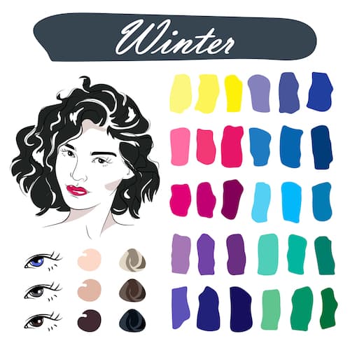
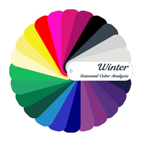
Winter Palette Characteristics
Finally, the Winter palette captures cool, deep, and clear colors, perfectly mirroring the starkness of the winter season.
Suitable for those classified under Cool Winter, Deep Winter, Bright Winter, and Light Winter, this palette boasts bold and saturated colors.
You’ll find winter colors like icy blues, rich purples, and dramatic reds, designed to stand out against the often-muted winter landscape.
- Cool Winter: Icy greys and cool blues translate the chill of winter.
- Deep Winter: Incorporates black and deep, cool reds for a striking contrast.
- Bright Winter: Fuchsia and electric blue are echoes of winter’s bright, clear nights.
- Light Winter: Pale pinks and soft blues offer subtlety within the high contrast.
Cool Undertones Spectrum
Individuals with cool undertones often have a rosy, pinkish, or bluish hue to their skin.
They tend to look great in shades that fall on the cool side of the color spectrum. For instance:
| Cool Colors Examples | Best for |
|---|---|
| Sapphire and Sky Blue | Highlighting blue eyes |
| Emerald and Mint Green | Complementing cool undertones |
| Lavender and Amethyst | Illuminating pinkish hues |
Colors that are crisp and vibrant, like deep purples and blues, accentuate their natural coolness and can make their complexion appear more radiant.
Warm Undertones Selection
Conversely, those with warm undertones will notice their skin has a golden brown, yellow, or peachy quality.
They shine in warm colors that mirror the warmth of their undertone.
Some effective choices include:
- Burnt Orange and Gold: Emphasizing warm skin tones
- Olive and Moss Green: Enhancing features while remaining subdued
- Tomato Red and Rust: Offering a vibrant look that aligns with their natural palette
Choosing the right warm colors can make a person’s skin look brighter and more vibrant, complementing any warm-toned features they may possess.
Neutral Undertones and Versatility
People with neutral undertones have the advantage of versatility, being able to wear colors from both cool and warm spectrums.
Their skin typically does not have an obvious pink or sallow hue but possesses a balanced color.
Earth tones and muted hues typically work well for neutrals, such as:
- Light Peach and Soft Mauve: For a subtle and sophisticated appearance
- Teal and Olive: As versatile choices that harmonize with most features
Neutral undertones serve as a flexible canvas for a broad range of colors, allowing for experimentation and a diverse wardrobe palette.
Choosing Colors for Natural Features
Each individual has a unique combination of skin tone, eye color, and hair color that can be flattered by specific colors in their wardrobe.
People with a cool undertone in their skin usually look best in colors like blue, green, and purple, while those with warm undertones are complemented by earth tones like red, orange, and yellow.
For instance, someone with olive skin might thrive in a deep emerald green, while someone with porcelain skin may find lavender to be exceptionally flattering.
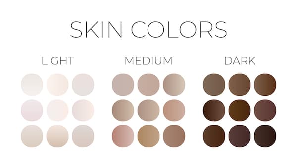
- Fair Skin: Soft pastels, crisp white
- Medium Skin: Rich autumnal shades, bold primaries
- Dark Skin: Vibrant jewel tones, saturated hues
Colors to Enhance Personal Style
Personal style is reflected in the choice of clothing, including the colors one wears.
It’s not only about the best colors but also about what each individual feels confident wearing.
Someone with a minimalist aesthetic may prefer a neutral color palette, with shades of gray, beige, and navy.
In contrast, a person who enjoys more attention might opt for a personal color palette with bold colors like fuchsia or electric blue.
The key is to choose colors that match your personality while also accentuating your best features.
- Bold Personalities: Brights and neons
- Understated Elegance: Earthy neutrals, soft pastels
Color Contrast
Seasonal colors can reflect the changing environment and create a harmonious look.
However, it’s not just about the colors individually, but also about what colors within that season work well together – especially when we’re talking about putting together perfect outfits.
This is where color contrast comes in.
Color contrast refers to the degree of visual difference between colors, impacting how they interact on a palette.
Harmony is achieved when colors create a pleasing or coherent composition.
These principles are essential in color season analysis to craft a look that enhances a person’s natural appearance.
Here’s a simplified table to guide what colors one could wear together in each season to align with the typical color palettes associated with the time of year:
| Season | Color Palette |
|---|---|
| Spring | Light pastels, floral tones |
| Summer | Vivid brights, clear hues |
| Autumn | Deep earth tones, rich reds |
| Winter | Cool blues, icy pastels, white |
They should adjust the specific shades based on their personal color palette to maintain consistency with their natural features and style preferences while staying seasonally appropriate.
For example, a person who loves summer brights with a cooler complex may incorporate a vibrant aqua instead of a warm coral.
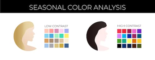
Understanding High Contrast
High contrast combinations involve colors that are opposite on the color wheel or have significant variations in lightness and darkness.
They often include pure colors or vibrant colors that stand apart distinctly when viewed in natural light.
Such palettes can be dramatic and eye-catching, typically combining bright colors with dark colors to create a look that pops.
- Usage: People with a high contrast in their personal coloring can carry these combinations effortlessly, often advised by a color consultant.
- Example: A classic high contrast look could involve pairing a pure white shirt with a jet-black suit.
Working with Low Contrast
Conversely, low contrast refers to colors that are similar in tone or have a subdued differentiation.
These color pairings rely on subtle variations and often use clear colors to achieve a gentle and sophisticated blend.
They work well in environments with softer lighting, where the nuances can be appreciated without appearing washed out.
- Technique: To create low contrast, individuals and color consultants select colors that are adjacent on the color wheel or have a minimal difference in brightness.
- Application: Suitable for those with softer personal coloring, ensuring harmonious and elegant ensembles that complement rather than compete with the wearer’s features.
The key to personal coloring is the harmony between one’s natural coloring and their chosen palette.
When these are in sync, the colors can make an individual look more vibrant, healthy, and energetic.
Accessorizing with Seasonal Colors
If you feel that seasonal color analysis leaves you limited in what you should wear, accessorizing is where you can add personality to an outfit.
For someone with autumn characteristics, gold jewelry might enhance the rich and earthy tones in their wardrobe while a person with a winter palette could choose a bright, bold lip color to offer a striking contrast against the more vivid and deeper shades in their attire.
The choice of accessories, whether it be scarves, belts, or hats, follows the same principles of coordination.
These items are selected to complement or tastefully contrast their main outfit components, reinforcing a cohesive look.
Accessories not only complete an outfit but also allow you to experiment with colors you might not typically wear in your clothing.
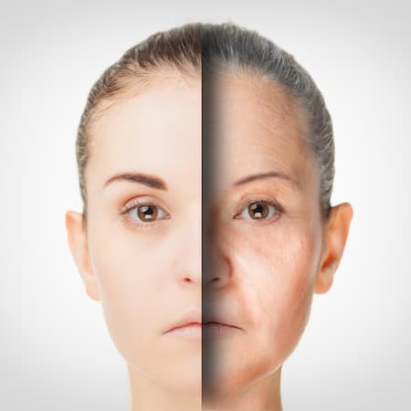
Influence of Aging On Color Seasons
This section delves deeper into specific aspects of color analysis, discussing how aging affects color seasons and the psychological impacts of different colors.
As individuals age, their skin, hair, and eye colors can change, impacting the color season they fit into.
For instance, hair might transition to silver or white, softening the overall color palette of a person.
Here’s a table that can exemplify typical changes:
| Age-Related Change | Impact on Color Season |
|---|---|
| Hair lightens or grays | May shift from a ‘Winter’ to a ‘Summer’ |
| Skin loses pigmentation. | Warmer colors may become less flattering |
| Eyes become lighter | Bright colors may overpower natural beauty |
People should review their color season every so often as they age to ensure they continue to select shades that enhance their natural features.
Psychology of Colors
Colors evoke emotions and can influence perception and behavior.
For instance, hot pink might be associated with fun and youthful energy, while emerald green is often seen as sophisticated and calming.
The psychology of color is important to consider when selecting clothing, as it can subtly communicate personality and mood.
- Hot pink: Evokes playfulness and a bold presence.
- Bright orange: Suggests confidence and enthusiasm.
- Emerald green: Can convey a sense of tranquility and elegance.
- Baby blue: Often associated with serenity and softness.
Including these color considerations in your wardrobe allows for a deliberate approach to how you are perceived and can be an integral part of personal branding and self-expression.
Conclusion
Different color palettes work best for individuals based on main factors including skin color, hair color, and eye color.
A seasonal color analysis will help you determine what season best suits you when it comes to both cosmetics and your wardrobe.
Those who have blue undertones will find that their skin harmonizes well with different colors than someone who has yellow undertones, and vice versa.
The same is true for those with lighter hair vs those with darker hair.
Other Posts You Might Like: